Fifa Rank Analysis in Power BI

Time to dive into FIFA ranking data with the power of Power BI!

Tracking how a country’s FIFA ranking has evolved over time offers a compelling look at its football journey. In this Power BI walkthrough, we’ll visualize the month-wise ranking trend for any selected country and year using an interactive line chart. Alongside this, we’ve also included a table that highlights the exact months when the country reached the #1 position — offering a complete picture of its performance timeline.

Users can interactively select a country and a year to instantly see how rankings changed month by month and when that nation held the top spot.

Download source data

Tracking FIFA Ranking Trends and Top Spot History

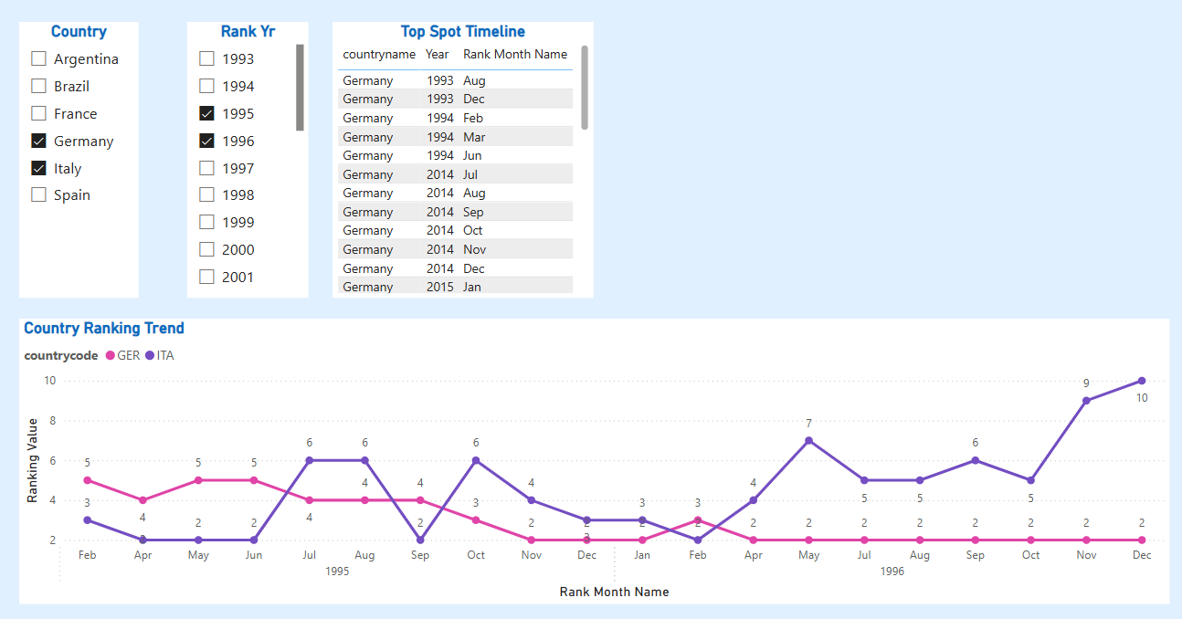
First step is to begin by importing your dataset, which includes FIFA rankings over time. We’ll be focusing on visualizing how a single country’s ranking changed throughout a specific year. To allow users to explore the data dynamically, we have 2 slicers to your report:

  1. Country Slicer: So the user can select any country of interest.
  2. Year Slicer: To filter the ranking data by a particular year.

These slicers will ensure that our line chart only reflects the selected combination of country and year.

By default, months may appear as numbers (e.g., 1 for January, 2 for February), which can be harder to interpret in visuals. To make the timeline easier to follow: 

Rank Month Name = FORMAT(rankcal[rankdate], "MMM")

This will return short, readable month names like "Jan", "Feb", "Mar", etc., improving the readability of the X-axis in our chart.

To ensure months appear in the correct order (not alphabetically), sort the Rank Month Name column by the numeric month:

  • Go to Data view (table icon on the left) and click on the Rank Month Name column.
  • In the top ribbon, select “Sort by Column” and choose Rank Month as the column to sort by.

This tells Power BI: whenever you use Rank Month Name in visuals, sort it using the month number.

Next step is to make sure Rank column is handled properly. When used in visuals, power BI defaults to aggregate the value of rank by summing it or counting it which does not make sense. Solution is to create a new measure.

Ranking Value = SELECTEDVALUE(fifarank[rank])

This ensures that for each point on the line chart, the actual rank value is shown without aggregation errors.

Next step is to build the line chart.

  • X-axis: Use the Rank Month Name
  • Y-axis: Use the Ranking measure you created
  • Filters: Apply the slicers for Country and Year

I have added data markers and data labels to show the exact rank value at each month.

The "Top Spot Timeline" table shows all the months when the selected country was ranked #1. While the country selection directly affects this visual, the year selection does not — and that's intentional. Using Power BI's Edit Interactions feature, I’ve configured the visual to respond only to the Country slicer. This ensures that viewers always see the full history of top rankings for the selected country, regardless of the year filter. For this visual, a filter is required and that can be done as shown here.

FIFA Ranking Leaders Over Time

This visual highlights the number of times each country has secured the 1st position in the FIFA rankings. It provides a quick comparison of top-performing nations over time, showcasing consistency and dominance in international football.

To analyze which countries have held the No. 1 spot in FIFA rankings most frequently, I created a measure in Power BI:

Rank1 Count = CALCULATE(    COUNTROWS(fifarank),    fifarank[rank] = 1)

FIFA Rankings over time

To track how FIFA rankings vary over time, I built a stacked bar chart that displays rankings by country for each selected month and year. A slicer lets users choose a specific timeframe, and the chart updates accordingly to show how different teams were ranked during that period. This helps analyze shifts in team performance and compare standings across countries at any given point in time.